Back to press
Brand

How to get eokit right

The name, the mark, the colours and the way we write. Short on rules, long on examples. Take what you need and write to us if something is missing.

01 · The name

It is always lowercase

Right eokit
Wrong eoKITEOKITEokiteo-kiteo kit
  • Always lowercase, one word, even at the start of a sentence.
  • Never set it in capitals, even in headlines, eyebrows or tables that are otherwise uppercase. In code, the .brand utility opts a word out of a caps run.
  • No legal suffix: never “eokit GmbH” or similar. The company behind eokit is aigentcy S.A., named in the legal texts.
  • The agents are “eokit agents”, never “the eokits”.
02 · The mark

One cube, three surfaces

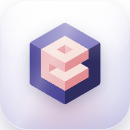
The mark is a cube built from the layers of a knowledge base. It ships as a flat mark for documents and as a glass tile for product surfaces.

Flat mark · light ground
Flat mark · night ground
Glass tiles · product surfaces
Clear space The dashed frame is half the mark's height on every side. Nothing comes inside it: no text, no other logo, no edge of a photo.
Clear space Keep free space of at least half the mark's height on every side. Nothing sits inside it.
Minimum size 24 px on screen, 8 mm in print. Below that, use the mark without the wordmark.
Backgrounds Full colour on light, the dark tile on night surfaces. Never place the light tile on a dark photo.
03 · What not to do

Four ways to break it

Each panel shows the mistake itself, so nobody has to imagine it.

Do not stretch or squash it
Do not recolour the mark
Do not rotate or tilt it
Do not add effects or outlines
04 · Colour

Four families, one accent

Click any swatch to copy its hex. Peach is the only colour that asks for a click. Use it once per screen.

Core Ink carries every headline. Violet is the product; peach is the one thing you are meant to click.
Surfaces Three greys carry the whole site. Anything else is a mistake, not a decision.
Night The dark half: the CTA banner, the footer, the security sections.
Text Four steps, no more. If a text needs a fifth grey, the layout is the problem.
05 · Type

Onest, and nothing else

One family does the whole site. Weight and size carry the hierarchy. Never colour alone, and never italics.

Onest Everything: headlines, UI and body copy Medium 500 · Semibold 600 for labels
System stack Fallback while Onest loads ui-sans-serif, system-ui
  • Hero 42 px · −0.028em Everything a journalist needs
  • Section 32 px · −0.024em Move past AI fragmentation
  • Card title 18 px · −0.015em How we handle your data
  • Body 15 px · 0 Agents that run on the systems a team already uses.
  • Label 11 px · 0.08em MEDIA CONTACT
06 · Voice

Specific, and honest about the mess

The product promises evidence, so the writing has to behave the same way. Three habits carry most of it.

Say the number
Write this Evaluating a tender took six weeks. Now the first draft is ready in two days. Not this Dramatically accelerate your quoting process with AI.
Admit what went wrong
Write this The first index pulled in an archive nobody had opened since 2019. Not this The rollout was a complete success from day one.
No hype words
Write this It reads SharePoint and Outlook with the permissions people already had. Not this A revolutionary, seamless, next-generation AI experience.
Contact

Tell us what you need

Write a few lines, and we will get back to you.

New message

Stored in the EU, never used for marketing lists